When walking down a busy street filled with storefronts, have you ever found yourself drawn to a particular store without even knowing why? Chances are, the color scheme of that storefront played a major role in catching your attention. The psychology of colors is a well-known concept, and it applies to storefronts just as much as it does to marketing materials and branding. In fact, the right choice of colors can significantly impact the amount of foot traffic a store receives. In this blog post, we will dive into the fascinating world of storefront colors and explore how they can attract foot traffic and ultimately lead to business success.
Attracting Foot Traffic: Storefront Color Psychology
Understanding how different colors impact human behavior can provide a strategic advantage for your storefront. To optimize your storefront’s appeal and attract more foot traffic, it’s crucial to understand and utilize color psychology effectively:
Attention-grabbing colors:
Employ bright, vivid colors that catch the eye from afar. These could be your primary storefront colors or used to highlight specific sections or merchandise within the store.

Emotional connections:
Leverage colors that evoke emotions linked to your products or brand. For example, green for health stores or blue for tech businesses. Use these colors to build a strong emotional connection with your customers.
Seasonal shades:
Reflect the changing seasons or festive times of the year through your storefront’s color scheme. This keeps your storefront dynamic, relevant, and can spark interest in seasonal offerings.
Use of contrast:
High contrast color schemes are visually striking and can draw attention to specific elements of your storefront. Experiment with contrasting shades for your storefront signage or window displays.
Audience preferences:
Remember to consider the color preferences of your target audience when deciding on your color scheme. What might appeal to younger consumers could differ vastly from the preferences of an older demographic. Tailoring your colors to your customer base can help foster a deeper connection.
Each of these aspects plays a key role in utilizing color psychology to boost your storefront’s foot traffic, and subsequently, your business’s success.
Red – The Color of Urgency
Imagine a color that screams attention, ignites excitement, and injects a sense of urgency into the scene. Yes, we’re talking about the color red. Known for its vibrant and powerful persona, red has a unique ability to command a passerby’s attention instantaneously. No wonder it’s the go-to choice for clearance sales or ‘limited time offer’ signage. Its intensity lures people into taking action quickly. However, as compelling as it may be, one should remember to use this color judiciously. Too much red can tip the scale towards an overwhelming experience, and in some cases, may even foster stress. It’s all about striking that perfect balance – enough red to rouse curiosity and urgency, but not so much as to push potential customers away.
Blue – The Trust Builder
When it comes to instilling confidence and fostering a sense of stability, few colors can compete with blue. It’s as if a calm, tranquil sea or a clear, cloudless sky has the power to communicate dependability and reliability. In fact, a storefront bathed in varying shades of blue speaks to customers in a language that says your business is one they can trust. This makes it a preferred choice for industries such as healthcare, finance, or technology where trust plays an integral role. So, if you’re looking to project an image of dependability, consider harnessing the power of blue.
Green – The Color of Freshness and Growth
If you’re in the business of promoting growth, freshness, or sustainability, green is your color. Instantly evoking images of lush foliage, green not only represents health and tranquility but is synonymous with an eco-friendly ethos. This makes it an excellent choice for health stores, organic food markets, or even eco-conscious clothing brands. Step into the shoes of your potential customers, and imagine being drawn to a verdant green storefront, it’s like a breath of fresh air, inviting you to explore the natural, wholesome, and fresh offerings within. However, as with every color, striking a balance is key. Too much green could be overwhelming, but when used in the right proportion, it can create a fresh, invigorating, and vibrant shopping environment. Embrace the freshness of green and let your storefront bloom!
Yellow – The Happy Color
Think sunshine, think joy, think energy – yes, we’re talking about yellow! This vibrant hue is widely regarded as the embodiment of happiness and positivity. It’s like having a little piece of the sun shining on your storefront, evoking a sense of warmth, optimism, and vitality. This cheerful color can work wonders in creative spaces, trendy cafes, or stores geared towards children. Picture this: a dash of yellow illuminating your storefront, creating an irresistible magnet for smiles, warmth, and positive vibes. But remember, while yellow is sure to energize and uplift, too much can be overstimulating and might induce discomfort. So, use this sunny shade strategically to paint a picture of happiness that’s sure to attract a steady stream of foot traffic.
Purple – The Color of Luxury
Step into the realm of opulence with the color purple. A color that has been associated with nobility and grandeur throughout history, purple has an air of elegance that is hard to ignore. With its deep, rich tones, it effortlessly exudes an aura of luxury and exclusivity, making it a perfect choice for high-end boutiques or jewelry stores. Picture a storefront splashed with shades of purple, instantly lending an upscale feel to the establishment. It’s like an unspoken invitation to step in and immerse oneself in a lavish shopping experience. However, be mindful about the shade you choose, as darker purples convey wealth and luxury, while lighter shades such as lavender represent romance and charm.
White – The Clean Slate
Embrace the pristine charm of white! Revered as a symbol of freshness and simplicity, white can transform your storefront into a minimalist haven. It’s like a breath of crisp winter air, signaling a fresh start, a blank canvas waiting to be painted with vibrant displays. Imagine the striking contrast of colorful products against the snowy backdrop of a white storefront. It’s a sight that’s bound to captivate the eyes of passersby. White also conveys a sense of neutrality and cleanliness, further enhancing the appeal of your products. Yet, while the allure of a white storefront is undeniable, remember it calls for regular upkeep to maintain its immaculate appearance.
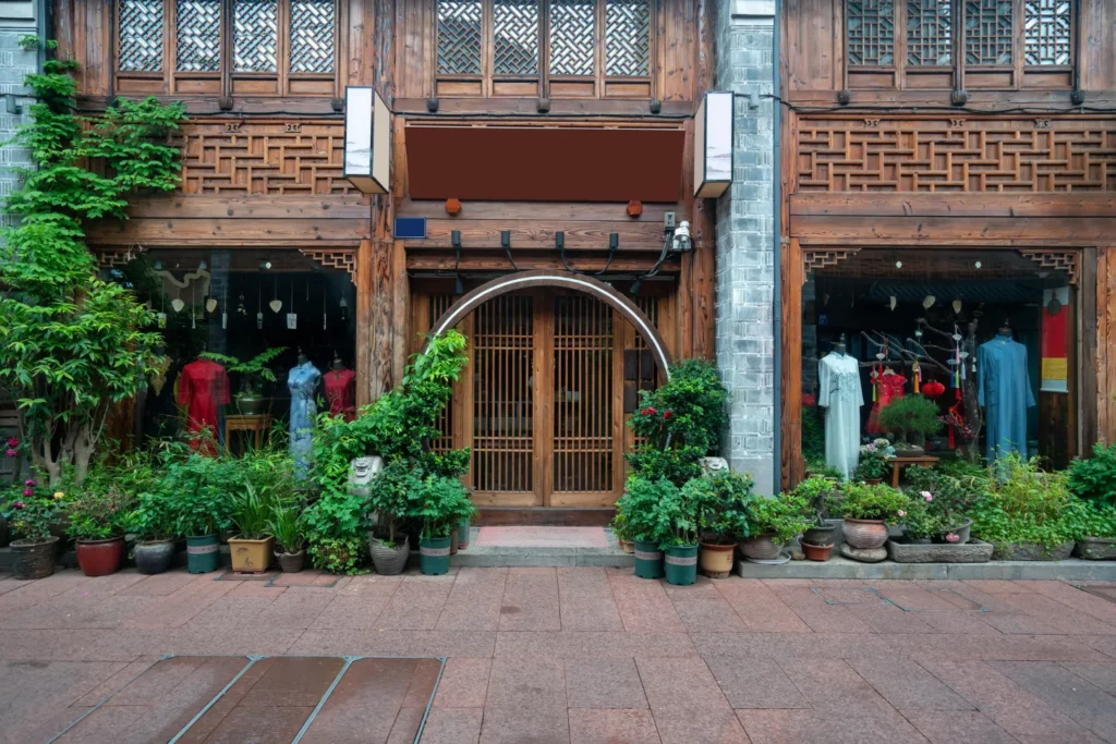
The Role of Neutrals in Storefront Design

Dive into the world of neutrality, where subtlety reigns supreme. Neutrals play an instrumental role in storefront design, harmonizing the visual impact and instilling a sense of balance. Their versatility allows them to blend seamlessly with any design aesthetic, offering a refreshing respite amidst the riot of colors.
Balance and harmony:
Neutrals serve as a soothing backdrop against more vibrant hues, ensuring they don’t overwhelm the viewer. Think of a black or white wall adorned with colorful merchandise – the neutral backdrop allows the products to pop without causing visual fatigue.
Versatility:
Whether it’s a chic, minimalist boutique or a rustic, vintage store, neutrals fit into any design aesthetic. Shades like beige, gray, or cream offer an array of possibilities, allowing you to play with different textures and finishes for a diverse visual experience.
Timelessness:
If you’re aiming for a design that stands the test of time, neutrals are your safest bet. Their classic appeal ensures that your storefront never looks dated or out of style. Plus, they offer the flexibility to switch up your merchandise or decor with the changing seasons or trends, without the need for a complete design overhaul.
Creating a soothing ambiance:
Particularly in sectors like health and wellness, neutrals can evoke a sense of calm and tranquility. Imagine stepping into a spa with soft beige walls and light wooden accents, it’s like an immediate escape from the hustle and bustle outside.
Conclusion
As we’ve explored, the psychology of storefront colors can be a game-changer in attracting foot traffic and enhancing your business success. The art of color choice is about more than aesthetics – it’s about invoking emotions, conveying your brand message, and ultimately, connecting with your target audience. Consider the power of red’s urgency, blue’s trust, green’s freshness, yellow’s happiness, purple’s luxury, and the crispness of white.
Remember to strike a balance, use contrasting shades, and tailor your colors to your audience. There’s no one-size-fits-all solution, so feel free to experiment, learn, and adapt. For expert advice on creating a color scheme that resonates with your brand and customers, don’t hesitate to contact us. Here’s to painting your path to success!