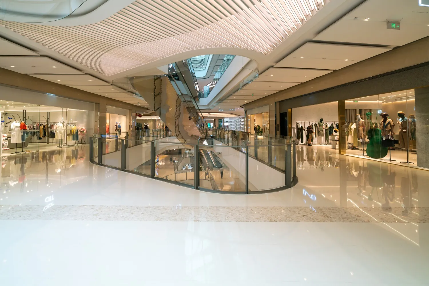
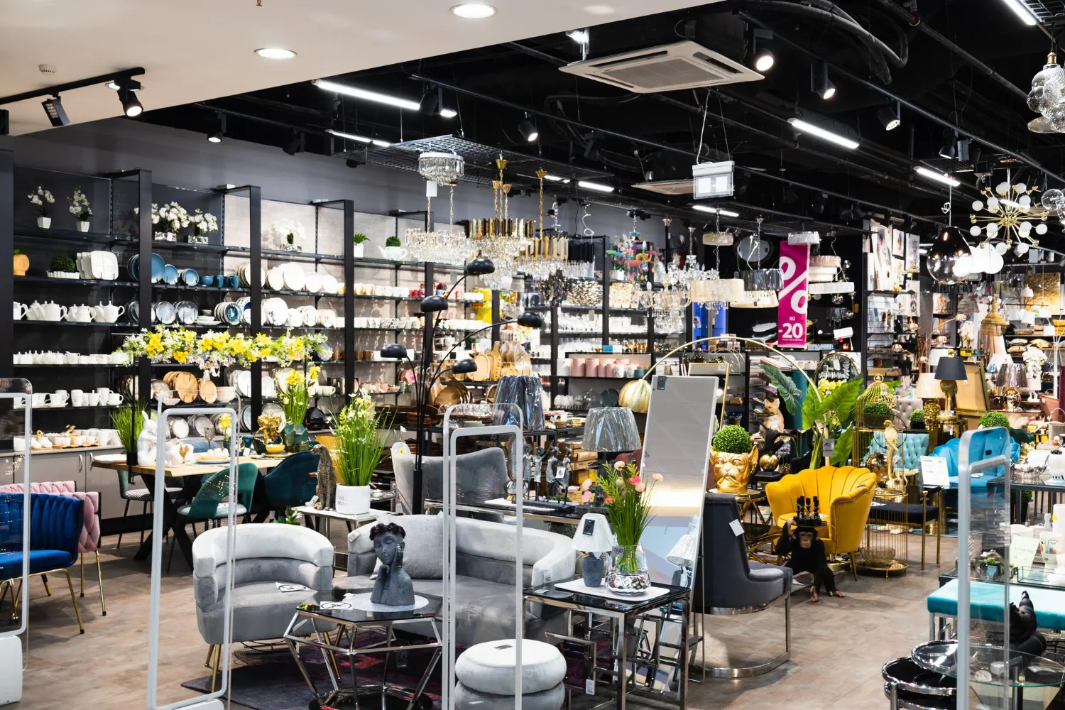
When we walk into a retail store, the first thing that catches our eye is usually the color scheme and overall aesthetic of the space. But have you ever stopped to think about how these colors actually affect your shopping experience? The use of color in retail spaces is a strategic decision that can greatly impact a customer’s perception and behavior. From creating a welcoming atmosphere to influencing purchasing decisions, color plays a crucial role in shaping the customer experience. In this blog post, we will explore the fascinating world of color psychology and its impact on customer experience in retail spaces.
The Emotional Impact of Colors on Customers
Colors have a profound emotional impact on customers in retail spaces. The use of specific colors can evoke different feelings and emotions, which can ultimately influence customer behavior and decision-making. Here are some of the emotional impacts that different colors have on customers:
Red:
This color is associated with energy, excitement, and urgency. It can create a sense of urgency and make customers feel compelled to make a purchase. Red can also increase heart rate and stimulate appetite, making it a popular choice for restaurants and food-related businesses.
Blue:
Blue is often associated with trust, reliability, and serenity. It has a calming effect and can make customers feel more at ease and comfortable in a retail environment. This is why many banks and financial institutions use blue in their branding to create a sense of trust and security.
Green:
Green is often associated with nature, freshness, and tranquility. It can create a sense of relaxation and make customers feel more connected to the environment. Green is commonly used in health and wellness stores, as well as sustainable and eco-friendly brands.
Yellow:
Yellow is associated with happiness, positivity, and optimism. It can create a cheerful and uplifting atmosphere, making customers feel more positive about their shopping experience. Yellow is often used in retail spaces to grab attention and draw customers in.
Purple:
Purple is often associated with luxury, creativity, and royalty. It can create a sense of elegance and sophistication, making customers feel that they are purchasing a high-quality product. Purple is commonly used in luxury retail and beauty brands to create a sense of exclusivity.
Using Color to Differentiate Your Retail Space
Using color strategically in your retail space can help you stand out from the competition and create a unique and memorable experience for customers. Here are some ways you can use color to differentiate your retail space:
Branding:
Incorporate your brand colors throughout your store to create a cohesive and recognizable identity. Use your brand’s dominant color as an accent color on walls, signage, and displays. This will not only help customers associate the space with your brand but also create a sense of consistency and professionalism.
Highlighting products:
Use color to draw attention to specific products or areas of your store. For example, you can use bold and vibrant colors for displays or shelving units that showcase new or featured products. This will help customers easily identify these items and create a focal point within your store.
Creating zones:
Differentiate various sections of your store by using color to designate different zones. For example, you can use warm colors like red or orange for the sales or discount section, while cool colors like blue or green can be used for more relaxed areas such as seating or fitting rooms. This will help customers navigate your store and create a visually interesting and organized layout.
Seasonal themes:
Incorporate seasonal colors into your store design to create a sense of excitement and anticipation. Whether it’s using warm and cozy colors during the winter holidays or vibrant and fresh colors during the spring, aligning your color scheme with the seasons can create a dynamic and ever-changing environment for customers.
Unexpected color combinations:
Consider using unexpected color combinations that are unique to your brand. This can help your store stand out and leave a lasting impression on customers. Experiment with complementary or contrasting colors that evoke a specific mood or atmosphere, aligning with your brand’s personality.
Influencing Customer Perceptions with Colors
Colors have a powerful impact on customer perceptions in retail spaces. By strategically incorporating specific colors, retailers can influence how customers perceive their brand and products. Here are some ways in which colors can influence customer perceptions:
Brand identity:
The colors used in your branding can shape how customers perceive your brand. Bright and bold colors may convey a sense of energy and excitement, while muted and neutral tones may suggest sophistication and elegance. Choosing the right colors that align with your brand values can help create a strong and memorable brand identity.
Product quality:
The colors used in your retail space can also impact how customers perceive the quality of your products. For example, using rich and luxurious colors like deep purples or metallic tones can create a perception of high-end and premium products. On the other hand, bright and vibrant colors may suggest affordability and youthfulness.
Atmosphere and ambiance:
Colors have the power to create a specific atmosphere and influence how customers feel when they enter your store. Warm colors like red and orange can create a sense of energy and urgency, while cool colors like blue and green can promote calmness and relaxation. By choosing the right color palette, retailers can shape the overall ambiance of their store and enhance the customer experience.
Target audience:
Different colors can appeal to different demographics. For example, pastel colors may attract a younger audience, while earth tones may resonate more with an older demographic. By understanding your target audience and their preferences, you can choose colors that are more likely to resonate with them and create a positive perception of your brand.
Choosing the Right Colors for Your Brand Identity
When it comes to choosing the right colors for your brand identity, there are several factors to consider. First and foremost, you want to ensure that the colors you select align with your brand values and messaging. Think about what emotions or feelings you want to evoke in your customers when they think of your brand. Is your retail store focused on providing a fun and energetic experience? Or perhaps you want to convey a sense of luxury and sophistication. Once you have a clear understanding of your brand’s personality, you can start exploring different color options that reflect that.
Remember, your brand’s color palette should be consistent across all touchpoints, from your logo and signage to your website and store design. By choosing the right colors for your brand identity, you can create a visually cohesive and engaging retail experience that resonates with your customers.
The Power of Consistency in Color Scheme
Consistency is key when it comes to creating a cohesive and memorable customer experience in retail spaces. And one way to achieve this consistency is through the use of a well-planned color scheme. By sticking to a consistent color palette throughout your store, you create a sense of unity and cohesiveness that customers find comforting and visually appealing. This consistency also helps reinforce your brand identity and make your store easily recognizable to customers.
Whether it’s through the color of your walls, signage, or even packaging, a consistent color scheme can leave a lasting impression on customers and make them feel more connected to your brand. So, when designing your retail space, don’t underestimate the power of a well-executed color scheme to enhance the overall customer experience.
Color Trends in Retail Spaces
Color trends in retail spaces are constantly evolving, reflecting the ever-changing tastes and preferences of consumers. Retailers are always looking for innovative ways to incorporate trendy colors into their store designs to attract and engage customers. Currently, some popular color trends include earthy tones like terracotta and olive green, which create a sense of warmth and connection to nature.
Vibrant jewel tones such as deep blues and rich purples are also gaining popularity, adding a touch of luxury and sophistication to retail spaces. By staying up-to-date with color trends, retailers can create visually appealing and modern environments that resonate with their target audience, ultimately enhancing the customer experience.
Conclusion
In conclusion, the impact of color on customer experience in retail spaces is undeniable. From the emotional impact of colors to the ability to differentiate your retail space and influence customer perceptions, color plays a vital role in shaping the overall customer experience. By strategically incorporating colors that align with your brand values, target audience, and desired emotions, you can create a unique and memorable environment that resonates with customers. Consistency in your color scheme and careful consideration of lighting can further enhance the customer experience and reinforce your brand identity.
So, start exploring the world of color psychology, experiment with different combinations, and create a retail space that leaves a lasting impression on your customers. If you have any questions or need further assistance, feel free to contact us. We’re here to help you make color work for your business.


